Your thoughts about ICM please ...

Glenn

Well-Known Member
Registered
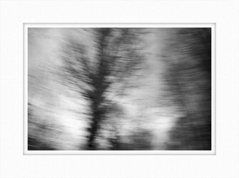
I have been trying to make some ICM (Intentional Camera Movement) images for an upcoming camera club competition but am having difficulty understanding what might contribute to a good black and white ICM. I am OK with the colour ones and have found that I like pastels tones and a variation of colour, but without that colour element I am finding it a challenge produce a good black and white one. So I thought I'd ask if anyone has some thoughts on the subject.

One of my better attempts below.
ICM_3.jpg
 
I have messed about with ICM in various forms and find that colour does look better "most of the time" (not sure I am allowed to say that here!) BW seems to need stronger form with more contrast and added grain, for trees/woods I tend to move the camera vertically for landscape move horizontally and for busy scenes I have tried giggling the camera about - shutter speeds are normally about 1 second but anything from 1/15 to 3 seconds can be interesting - sometimes you get quite good unexpected results but most the time (in my case, you don't).....
 
First off, I have never tried this so take my comments in that context. I think for me, this might work in colour where different hues would add an extra dimension. I think you need more recognisable shapes albeit smudged or blurred in black and white; but as I say, that's a personal take based on no experience.
 
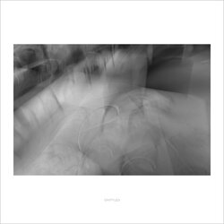
I think it was Glenn that was asking for some feedback Martin but I like your offerings, particularly the first three and no. three is weirdly wonderful.
 
I have messed about with ICM in various forms and find that colour does look better "most of the time" (not sure I am allowed to say that here!) BW seems to need stronger form with more contrast and added grain, for trees/woods I tend to move the camera vertically for landscape move horizontally and for busy scenes I have tried giggling the camera about - shutter speeds are normally about 1 second but anything from 1/15 to 3 seconds can be interesting - sometimes you get quite good unexpected results but most the time (in my case, you don't).....
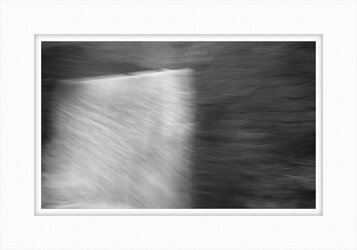
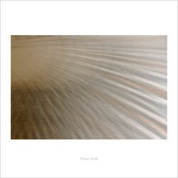
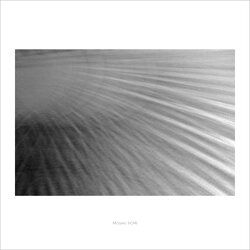
Yes, that matches my experience. I have been using a slower shutter speed, about 1 to 5 seconds although 1.6 seconds crops up quite a lot. Below is a pair of images I took of a Roman mosaic. The original had a sun motif with rays so I followed one of the rays along its length. As you say, strong shapes help. The BW one works but I think the colour one is better. I am hoping it will make a nice print on VFA paper.

I haven't tried adding grain. I might try that next.


Ravenna_day 2_2.jpgRavenna_day 2_1.jpg
 
Last edited:
First off, I have never tried this so take my comments in that context. I think for me, this might work in colour where different hues would add an extra dimension. I think you need more recognisable shapes albeit smudged or blurred in black and white; but as I say, that's a personal take based on no experience.
Thanks John. Yes, I agree. Please see my answer to Steve above. Recognisable shapes work well (see image below of the restaurant tables) but I quite like the abstract feel of some of these where the background isn't necessarily recognisable but sufficient form remains to give a strong indication of the original shapes. They do still seem a touch murky and increasing the contrast doesn't improve the aesthetic appeal in these eyes.
 
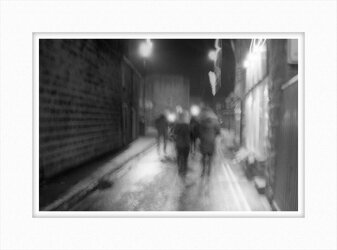
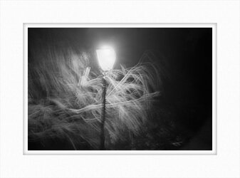
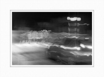
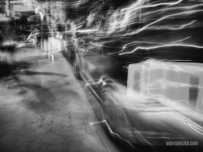
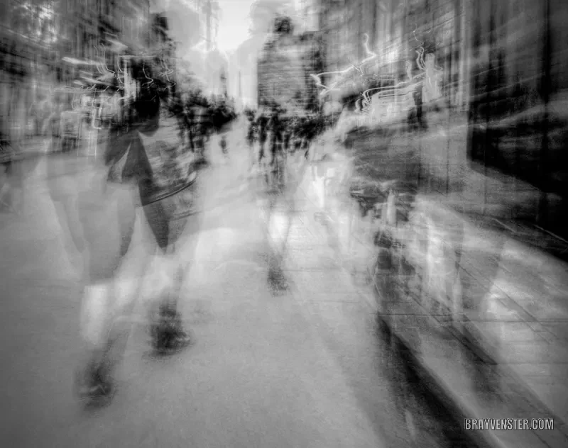
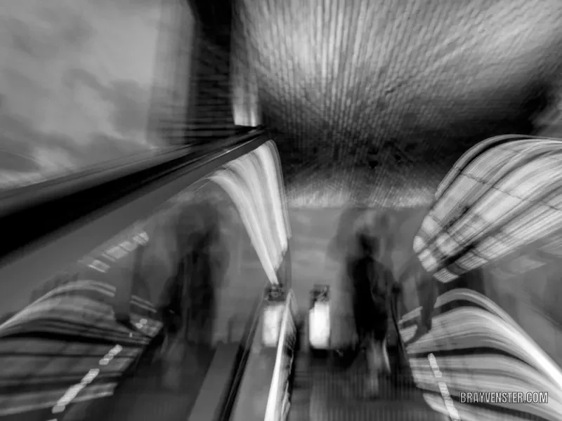
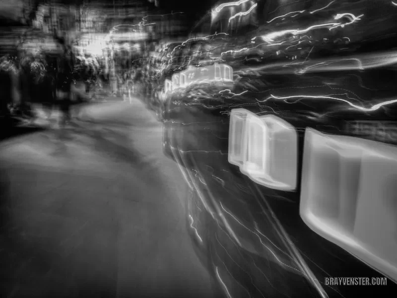
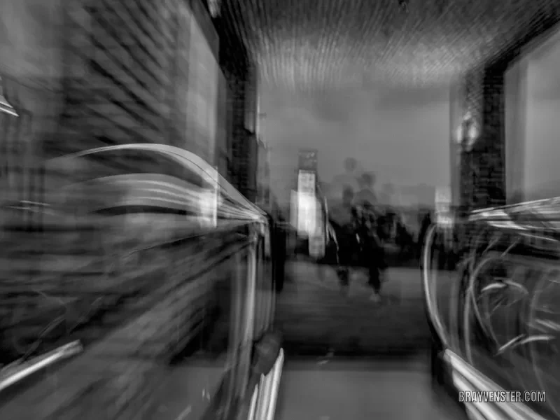
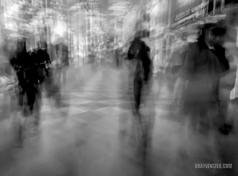
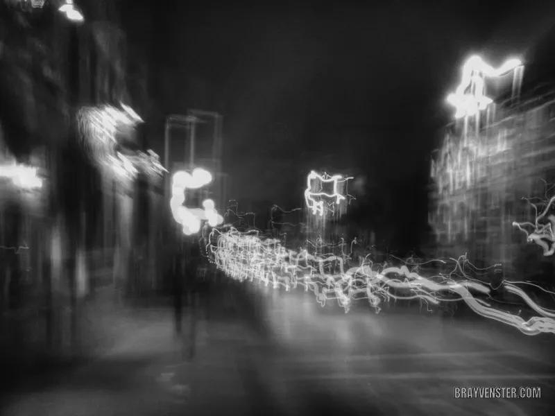
A few ideas, Glenn: some taken at night and a couple during the daytime
Thanks Martin. An interesting collection although the family crossing the road works best for me with the street lamp and tree a close second choice. I haven't tried going out at night for ICM yet, that sounds like an interesting thing to do. I might give that a go in the next few evenings. Most of what I have been trying is with static subjects so perhaps I should be looking for movement in the subject as well.

I quite like this one of tables outside a restaurant with freshly laundered white table cloths which is less abstract than the others I have been taking. The whiteness of the tablecloths contrasts everything around them.

ICM_2.jpg
 
Last edited:
Not as gentle as yours I quite like the softness of your last one. I shot these on a day out last year bit of day and night not great in BW they do look better in colour (still not great though!)...


@Steve

Some nice images here, particularly 2, 3 and 6. I still haven't tried ICM after dark although I quite like the way it pushes up the contrast. 2 and 6 have an attractive ethereal feel.
 
2, 6 and 7 for me Steve but the whole set work well. Must give this a try.
I suggest using a digital camera. In my experience the hit rate is poor and I think I could waste a lot of film trying to get a good one. I took about 40 shots of the table cloths and got two I was happy with.
 
Last edited:
Back
Top