
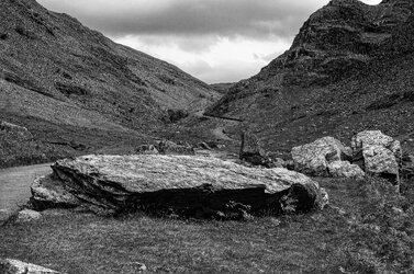
The road up the western side of Honister Pass doesn't improve give age (unlike a bottle of wine) Poor road surface, bolder strewn and with drivers finding out the Cumbria Passes are not like driving through the street's of leafy Surry

-
Thank You For Visiting... Please Click Here and sign up to contribute
You are using an out of date browser. It may not display this or other websites correctly.
You should upgrade or use an alternative browser.
You should upgrade or use an alternative browser.
The western ascent of Honister Pass
- Thread starter John King
- Start date
Yes I agree. It had already been toned down but it could do with a bit more. It was a more or less flat surface with what appeared to be white quartz so that was the problem without it being obvious. Actually the traffic wasn't that bad yesterday but the standard of driving made up for the lack of cars. Hence my comment!
I was on my m/bike so was able to avoid most of it.
I was on my m/bike so was able to avoid most of it.
In no way a criticism, but I use PhotoLab to reduce Micro Contrast and then adjusted the shadow fine contrast to bring out detail in the darker areas. See what you think…

You don't have to. I just explained the tools I used from PhotoLab. You will need to find your equivalents.I am at a loss to understand why I should use Photolab! I
I like this. I think I marginally prefer Joanna's version with the lifted shadow, though on the other hand the 'revealed' shadow does look a bit forced. I would venture that the upload on both is a bit 'crunchy'.
This seems to be quite a common problem when folks want bring out detail.I would venture that the upload on both is a bit 'crunchy'.
First, the original is a JPG and this is always a bad starting point. for detail enhancement, since there are not enough different shades to be subtle with.
And, yes I do have to mention PhotoLab and FilmPack because they provide a wide variety of sharpening, detail and contrast tools, starting with ClearView Plus, which tends to be the one that most people seem to choose when coming from PS
No sharpening…

ClearView Plus…

But then they also provide micro-contrast (the next most coarse from ClearView Plus) and the four Fine contrast sliders, which allow selective fine contrast on any combination of shadows, mid-tone, highlights and/or "global"
Of course other very good products are also available but, I don't know them as well. The key to effective sharpening is an intimate of your choice of product.
John, the textures in your photo look slightly too rough. And Joanna, the textures in yours look far too smooth. You both need to consult Toby to find out how to get a more natural look.")
Alan
Alan
Actually, if you look at mine, you will see one is quite rough and the other smooth - check the top hat. I also have several variants, created with the different sliders. I just didn't want to take up too much space in John's thread. Thanks for your input AlanJohn, the textures in your photo look slightly too rough. And Joanna, the textures in yours look far too smooth. You both need to consult Toby to find out how to get a more natural look.
Alan
Joanna, but in your second photo the hands and the coat look unnaturally smooth - like melted plastic with no hint of texture. He is playing with a mute. Maybe he has muted the texture...
I am aware of the fact that we have discussed this before. And I know you have a preference for the smooth, grain -free look. I respect that, and like the fact that we can discuss these things and agree to differ.
Alan
I am aware of the fact that we have discussed this before. And I know you have a preference for the smooth, grain -free look. I respect that, and like the fact that we can discuss these things and agree to differ.
Alan