

-
Thank You For Visiting... Please Click Here and sign up to contribute
You are using an out of date browser. It may not display this or other websites correctly.
You should upgrade or use an alternative browser.
You should upgrade or use an alternative browser.
Nudgee Beach
- Thread starter Jeff Ryan
- Start date
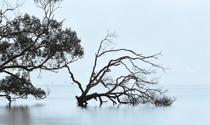

You seem to be interested in the feel your photographs generate. That's a good thing in my book. I like the treatment here, the straight horizon, the smoothed water and the tonality. If you want a nit, I would have liked to have seen more of the tree to the left which contrasts nicely in shape with the tree to the right.

I don't have an issue with your nit, honesty is always good. (nearly always, anyway)You seem to be interested in the feel your photographs generate. That's a good thing in my book. I like the treatment here, the straight horizon, the smoothed water and the tonality. If you want a nit, I would have liked to have seen more of the tree to the left which contrasts nicely in shape with the tree to the right.

I was seeing life to death, as a natural process with the trees. So I guess the dead tree was the focus (apart from the fact I couldn't get both in frame from where I was standing
)Thanks again!

Thank you.I like that. It is almost abstract and it works for me.

I like this, and it seems pretty spot on to me in terms of composition. It's good to see some LE on film. I see a lot of this kind of slightly minimalistic LE work on digital, and it increasingly seems too 'perfect', to the point that any 'feel' and sense of place is lost, it just feels like a technical exercise.
I like this has a lovely sense of tranquility about it.
Thanks Toby, much appreciated.I like this, and it seems pretty spot on to me in terms of composition. It's good to see some LE on film. I see a lot of this kind of slightly minimalistic LE work on digital, and it increasingly seems too 'perfect', to the point that any 'feel' and sense of place is lost, it just feels like a technical exercise.
Thank you Helen, glad you like it.I like this has a lovely sense of tranquility about it.

It looks suspiciously colourful for this forum. Anyway, the B&W is much nicer.
Of the two images i feel this is a much stronger composition. It is unfortunate that it doesn't have the silky smooth water that the first has and as Toby says it isn't a black and white image and until now I am surprised that I hadn't noticed, but neither is the first image.
Yes, both images are from the same roll of Fomapan 100 and were edited using the same Lith -Selenium/Gold split tone. I usually apply some type of toning to my B&W / monochrome photos, often a platinum tone but I thought these two benefited from a cooler tone.
Does "black and white" mean not toned in this forum?
Thanks again.
Does "black and white" mean not toned in this forum?
Thanks again.

I'll keep that in mind, thanksNo. Martin mostly applies a warm tone to his fine photographs and I have followed suit. Others use a platinum or selenium-like toning. Your blue is a little more saturated than we are used to is all.
Yes, that looks good too. I played with a few variations.

Nudgee Beach, bayside Brisbane
Pentax K1000 with Pentax 135mm f3.5 lens
f13 @ 25 sec with ND 1024 filter
I think I prefer this original - it almost looks as though the tree on the right is a dead part of the tree in the left, which fits in with your ‘life to death’ vision.
For me, because the sky is so obviously blue (like a sky often is) and the tint is less obvious in the remainder, the tint is distracting.
But - as ever - it’s what you want that’s important