

-
Thank You For Visiting... Please Click Here and sign up to contribute
You are using an out of date browser. It may not display this or other websites correctly.
You should upgrade or use an alternative browser.
You should upgrade or use an alternative browser.
The Visigoths.
- Thread starter Nokin
- Start date
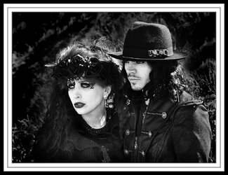

I feel that the processing is much too hard on this, the blacks are blocked out and the mid-tones are missing. I can see the effect that you want, but I think it would still be there of you pulled the contrast back and got some detail into those blacks.


Now Im taking a different stance-- I really like the very heavy processing on this one, the intensity of these two character deserves nothing less,
Geoff
Geoff

You know something is consistently not thought of in this digital world and that is the print.
When we edit a file we are always talking about tonal range, why , well its to do with the print, this image although on screen comes across at first sight as intense but it soon looses that appeal, printed it would not look right with jet black areas hitting out as this does on screen.
Content wise its a good strong image but could have had the same effect if the blacks would print correctly, its either your vision and if your happy with that fine, or its over zealous use of plugins that can destroy prints very quickly
When we edit a file we are always talking about tonal range, why , well its to do with the print, this image although on screen comes across at first sight as intense but it soon looses that appeal, printed it would not look right with jet black areas hitting out as this does on screen.
Content wise its a good strong image but could have had the same effect if the blacks would print correctly, its either your vision and if your happy with that fine, or its over zealous use of plugins that can destroy prints very quickly

Probably just a tad too heavy for my taste but I have to say that I have always been a big fan of having a good rich black in a picture if the subject demanded it. I've never been all that convinced with digital print blacks but in a traditional silver print they can lift an image to a whole new level.

You are quite right Martin .The image in its present form would not print out properly. More detail in the solid blacks is what is needed. Thank you everyone for your C/C . It has been most rewarding .You know something is consistently not thought of in this digital world and that is the print.
When we edit a file we are always talking about tonal range, why , well its to do with the print, this image although on screen comes across at first sight as intense but it soon looses that appeal, printed it would not look right with jet black areas hitting out as this does on screen.
Content wise its a good strong image but could have had the same effect if the blacks would print correctly, its either your vision and if your happy with that fine, or its over zealous use of plugins that can destroy prints very quickly
Back to the drawing board. In answer to the question to what someone asked . Yes I have more images from the Visigoths meeting, Watch this space.!!!!!!