

-
Thank You For Visiting... Please Click Here and sign up to contribute
You are using an out of date browser. It may not display this or other websites correctly.
You should upgrade or use an alternative browser.
You should upgrade or use an alternative browser.
From Place Fell - Lake District.
- Thread starter JimH
- Start date

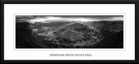

Super, the sweep of the hills frames the scene really well.

Very nice, I dont mind the darker areas works well

I like it, was it a series stitched or ??


We don't do 'kind' Jim, we do honest personal appraisals with the best intentions in mind.  So, a really nice image however I'm not too keen on the close crop at the top and I think the thick black frame competes for attention - perhaps a third of the thickness might be more suited but, as always, these are personal preferences and it's how you see the image and it's presentation that counts in the end.
So, a really nice image however I'm not too keen on the close crop at the top and I think the thick black frame competes for attention - perhaps a third of the thickness might be more suited but, as always, these are personal preferences and it's how you see the image and it's presentation that counts in the end.
Love the way you've worked on the light & dark areas. It creates a great sense of space which is perhaps reduced a little by cropping out much of the sky. It makes it feel a little constrained for me.
Hec
Hec

Overall a fabulous panoramic shot with some great tones and contrast, for me I'd like to see a little more detail in the dark shadows left and right as I think they are a tad to dark. After saying that it its a very accomplished image Jim.
Great presentation too.
Regards
P
Great presentation too.
Regards
P

Great pano, don't mind the dark edges at all.
Dave
Dave

I use to live in Patterdale so a view I am very familiar with. Lovely, well accomplished shot. I have no problems with dark tones, as much of my own wok shows and vignetting corners should be compulsory!!!! . It's a style that works well with this shot. I do feel that you might be better presenting images without borders/frames as they can be distractive and also agree with the comments about the crop at the top possibly being a little tight. Just give the fells a little more head room.
. It's a style that works well with this shot. I do feel that you might be better presenting images without borders/frames as they can be distractive and also agree with the comments about the crop at the top possibly being a little tight. Just give the fells a little more head room.

Like the pic but the border is too heavy for online presentation IMO