

-
Thank You For Visiting... Please Click Here and sign up to contribute
You are using an out of date browser. It may not display this or other websites correctly.
You should upgrade or use an alternative browser.
You should upgrade or use an alternative browser.
Cushions - High Key
- Thread starter John2
- Start date
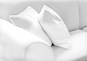

Rather pleasing, light, almost abstract.


I've taken the highlights down a bit but unfortunately there isn't much more texture detail in the original. Doesn't bother me that much though given the high key treatment. The square crop works but it still needs some space on the RHS. Just cropping the RHS doesn't work IMHO. Is it better? I'm not sure. Thoughts welcome.
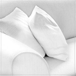
That looks really good. I don't think the textures matter that much. For me it is all about the shapes and all the various shades of white. That little black triangle is the cherry on the cake.

Yes - like this - simple but holds the (my) eyeI've taken the highlights down a bit but unfortunately there isn't much more texture detail in the original. Doesn't bother me that much though given the high key treatment. The square crop works but it still needs some space on the RHS. Just cropping the RHS doesn't work IMHO. Is it better? I'm not sure. Thoughts welcome.
View attachment 20228
