

-
Thank You For Visiting... Please Click Here and sign up to contribute
You are using an out of date browser. It may not display this or other websites correctly.
You should upgrade or use an alternative browser.
You should upgrade or use an alternative browser.
2 O'clock
- Thread starter regfinch
- Start date

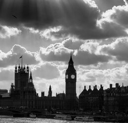


Its lovely picture Reg, --I can see the temptation to lift the highlights on building, but the title is 2 O'clock and if the eye is taken away from that its lose what the author wanted?
Geoff
Geoff
Last edited:

I have just been reading a comment by Martin about the need to consider what the image would be like as a print and so, with that in mind, I think that this image might benefit by lifting the very dark areas somewhat or go for a complete silhouette.
Norman
Norman

Its a nice image, I do think the shadows/darks have a little detail, they are not jet black, this is a perfect example where a little detail is better than none and gives a textural feel, if you copy and put this in PS you will see that Reg has the shadows just right


Very nice indeed Reg.